
How to Get Better at the Color Game and the Logo Color Game
The Color Game shows you a color for a few seconds and asks for it back. The Logo Game asks for a brand color you have seen a thousand times. How the 10-point score works, which way memory bends a color, how to read the sliders, and what a good round looks like.
Introduction
Most memory games test what you can put into words. The Color Game tests something you cannot: a color you saw a few seconds ago. It fills the card for a moment, disappears, and you rebuild it with three sliders. Its companion, the Logo Game, asks the same question about colors you have seen thousands of times. A real company logo arrives with one part painted the wrong color, and you put the brand's color back. Both score every color out of 10 by how close your version looks to the real one, and both reward the same habits. The numbers below are the rules of both games.
Three Colors, Ten Points Each, and No Clock on the Sliders
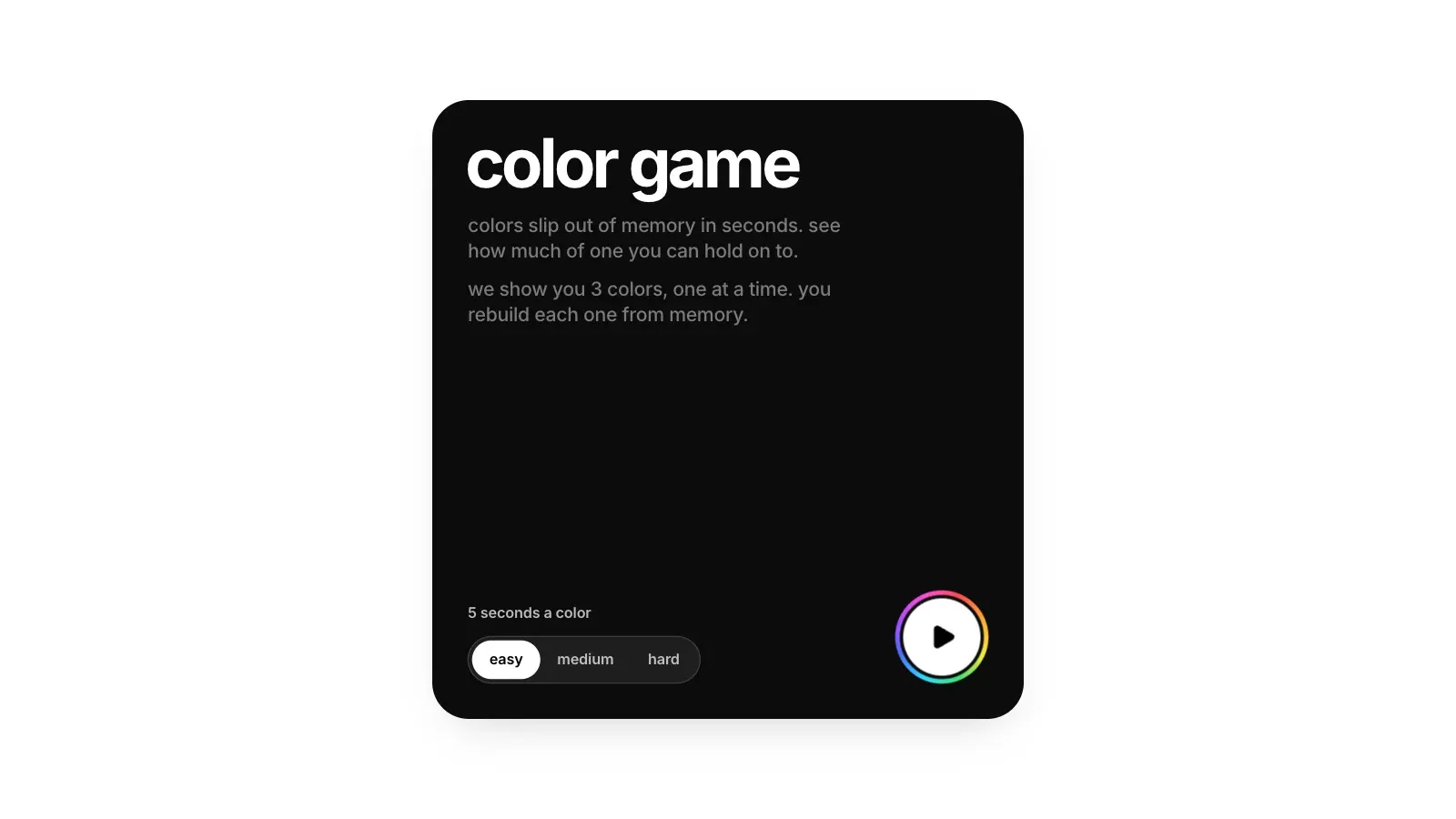
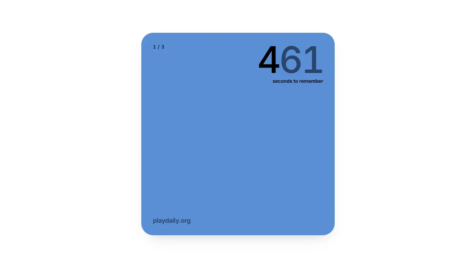
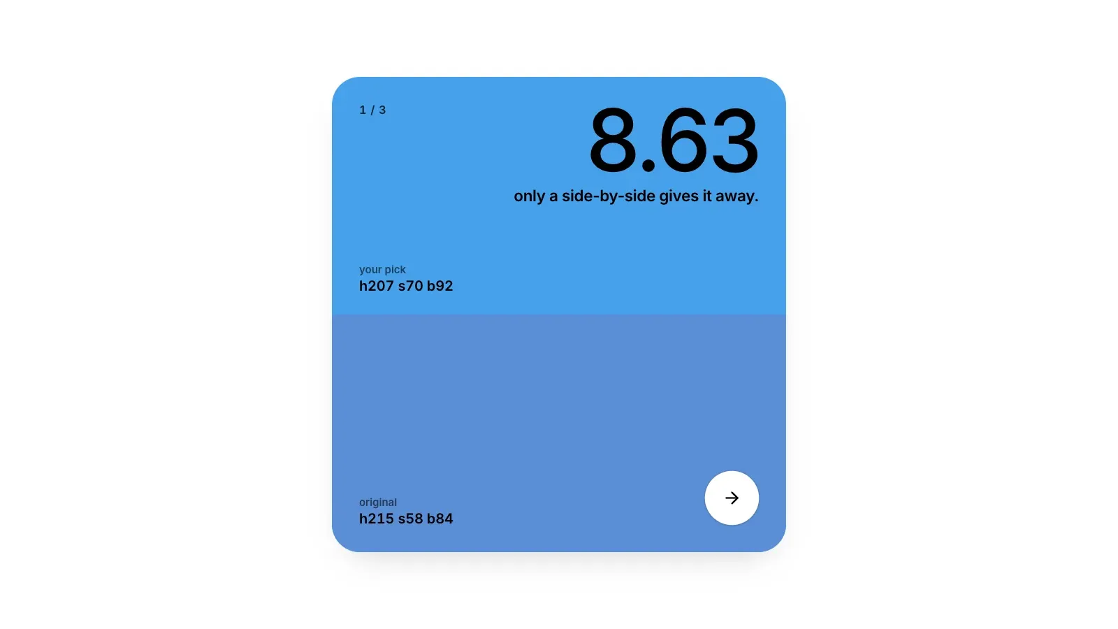
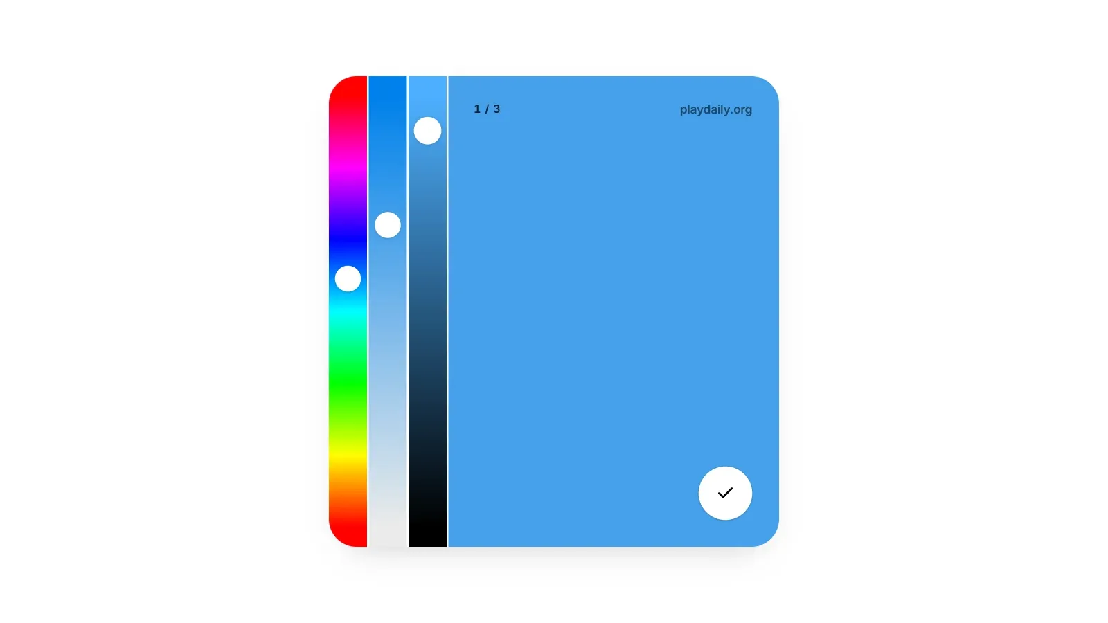
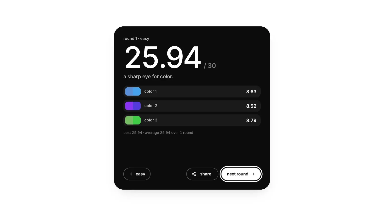
A round of the Color Game opens with Ready, Set, Go and deals three colors, one at a time. Each color floods the card while a countdown runs: 5 seconds on Easy, 3 on Medium and 2 on Hard. Then the color is gone and three bars slide in, for hue, saturation and brightness. Nothing times the sliders, so take as long as you need before you lock your color in. The original then appears beside your rebuild with a score out of 10, and three colors make a round out of 30.
A Shade Off Still Scores Eight
The score compares how different the two colors look, not how far apart the slider numbers are. The game converts both colors to CIELAB and measures the gap with CIEDE2000, the standard color-difference formula, on which a difference of about 1 is roughly the smallest the eye can pick out. Points follow a curve that is gentle on near misses and steep further out. A difference of 5 keeps 9.2 points, 10 keeps about 8, 20 keeps 5.7, and 30, which reads as a different color, keeps 3.7.
The tiers come off the same curve. A score of 9.5 or more, a difference under about 3.6, is a near copy. From 8, a difference up to about 10, it is the same color a little off. From 6 you had the right family but a visibly different shade, and below 4 the two look like different colors. The share text marks each color green from 8, yellow from 6, orange from 4 and red below that.
Remember What the Name Leaves Out
Memory holds a color's name far better than its exact shade, and fills in the rest with a more typical version of that name. Most lost points come from that drift, so the countdown is best spent on what the name does not tell you. Three habits do most of the work.
- Name it, then name the lean. You will remember blue without trying. Say how this blue differs: a little gray, leaning toward green. That difference is exactly what memory erases.
- Set saturation a notch low. Remembered colors come back stronger than they were, a bias measured as far back as 1960, when people recalled grass greener and brick redder than the real thing. If your rebuild keeps coming out the more vivid of the pair, aim below what feels right.
- Spend the seconds on the hard part. On a vivid color the hue carries the most points: on the blue above, 10 degrees of hue costs more than 10 percent of saturation or of brightness. On a pale or dark color the hue matters much less, and how light and how gray it is decide the score.
Brightness Is Not Lightness
The brightness slider measures how much light the screen gives a hue, not how light the color looks. On the CIELAB lightness scale, where 0 is black and 100 is white, full yellow sits near 97 and full blue near 32. So a deep, dark-looking blue can be at full brightness, while a yellow turns olive long before the slider gets low. Judge brightness by eye against the hue you have set, not by where the thumb sits.
The sliders start somewhere useless on purpose: half saturation, half brightness and a hue at least 60 degrees from the answer, so the starting point gives nothing away. Keep one order every time, hue first, then brightness, then saturation, then a last look at hue, so you never chase one slider while another is wrong.
Easy, Medium and Hard Change the Colors, Not the Scoring
Easy shows each color for 5 seconds and deals bright, vivid colors, from 45 percent saturation and 60 percent brightness up, most of which have a plain name. Medium cuts the look to 3 seconds and lets in paler and darker colors, from 25 percent saturation and 40 brightness. Hard allows 2 seconds and goes as low as 12 percent saturation and 22 brightness: the dusty, muddy, in-between colors that no basic color word covers. The scoring is identical in all three, and your best round and average are kept for each mode separately.
The Logo Game: One Part of a Real Logo Is Wrong
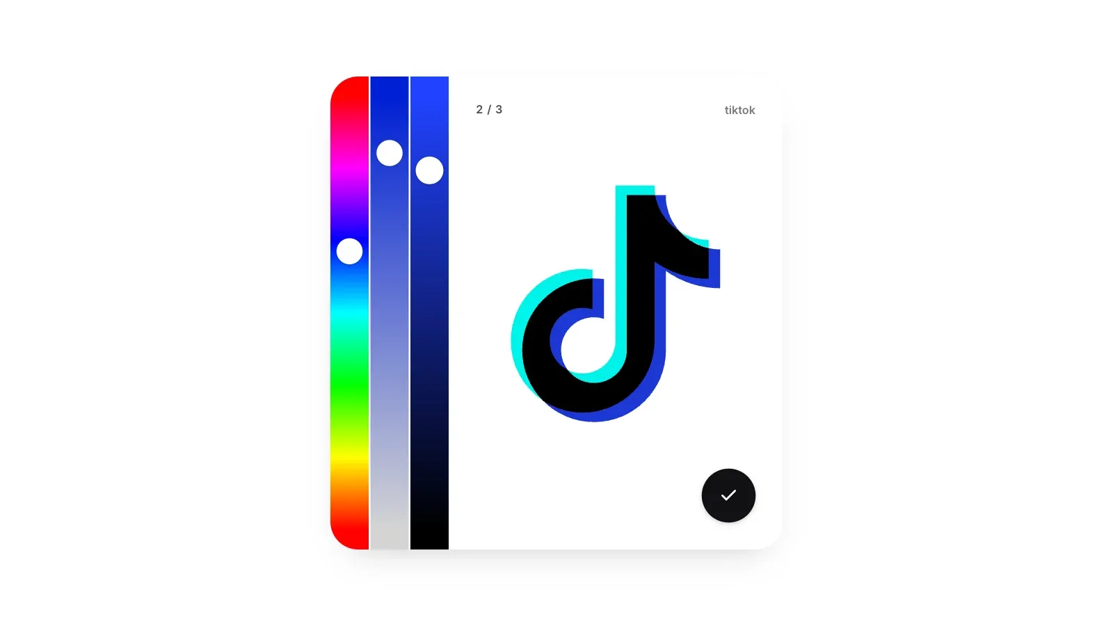
The Logo Game has no countdown. A real company logo appears with one part in the wrong color, and a thin line traces that part as the logo draws in, so you know which one to fix. The rest of the logo stays on screen and the brand's name sits in the corner. You restore the part with the same three sliders, and the reveal zooms in on it, your color beside the brand's, scored on the same curve. Three logos make a round out of 30.
The wrong color carries one real clue. It is always at least 60 degrees round the hue wheel from the true color, so the answer is never a close neighbour of what you are shown: if a part arrives blue, the brand's color is not a cyan, a blue or a purple. Its saturation and brightness are random and tell you nothing. The sliders start on the wrong color, so expect to move the hue a long way before the shade is worth fine-tuning.
Seeing a Logo Every Day Is Not the Same as Remembering It
Familiarity builds confidence much faster than detail. In a 2015 study at UCLA, only one of 85 students drew the Apple logo correctly from memory, and fewer than half picked the real one out of a set of near copies. Color has its own shortcut: memory files a brand's color under its name, a red or a blue, and redraws the shade as a typical version of that name. Three habits help.
- Mind the colors between names. TikTok's accent is a pink-red, and memory rounds it to plain red. Brand colors that sit between two names, a coral, a teal, a magenta, drift the furthest toward the nearer one.
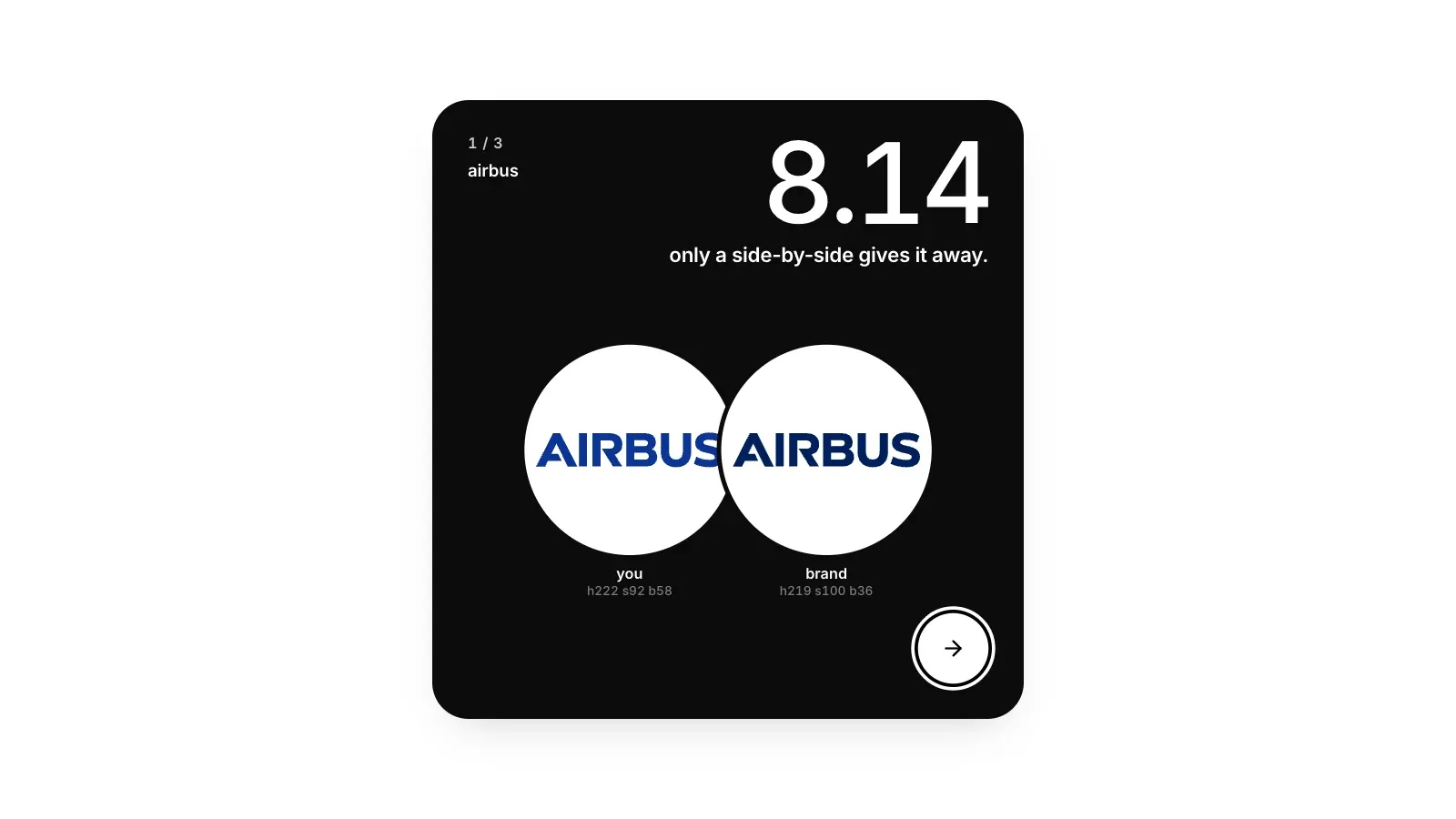
- Make deep colors darker than they feel. Remembered colors come back lighter as well as more vivid, so navy, forest green and burgundy are where brightness goes wrong. Airbus's navy, below, sits at 36 percent brightness; the rebuild beside it, at 58, gave away almost two points.
- Think of the screen, not the sign. The game's colors are the ones each logo file paints for screens. If you know a brand mostly from a box, a truck or a shop front, its screen color may look a little brighter than the one you remember.
Pick the Deck You Actually Know
The Logo Game deals from 977 logos in eight decks. Famous holds 107 household names and is the place to start. Fortune 500 is the biggest companies, Consumer is food, shops, cars and brands, and Big tech is tech companies and apps. Startups, YC and a16z test how closely you follow the startup world as much as your color memory, and Everything deals from the whole set. The game skips the last 120 logos it dealt you on your device, about 40 rounds' worth, while the deck has others left, and keeps a best round and an average for each deck.
When memory really has nothing to offer, play the odds. Of the 1,314 colored parts the game can ask about, a third are blue and a fifth are red, more than half between them. Yellow, purple and pink are about one part in twenty each.
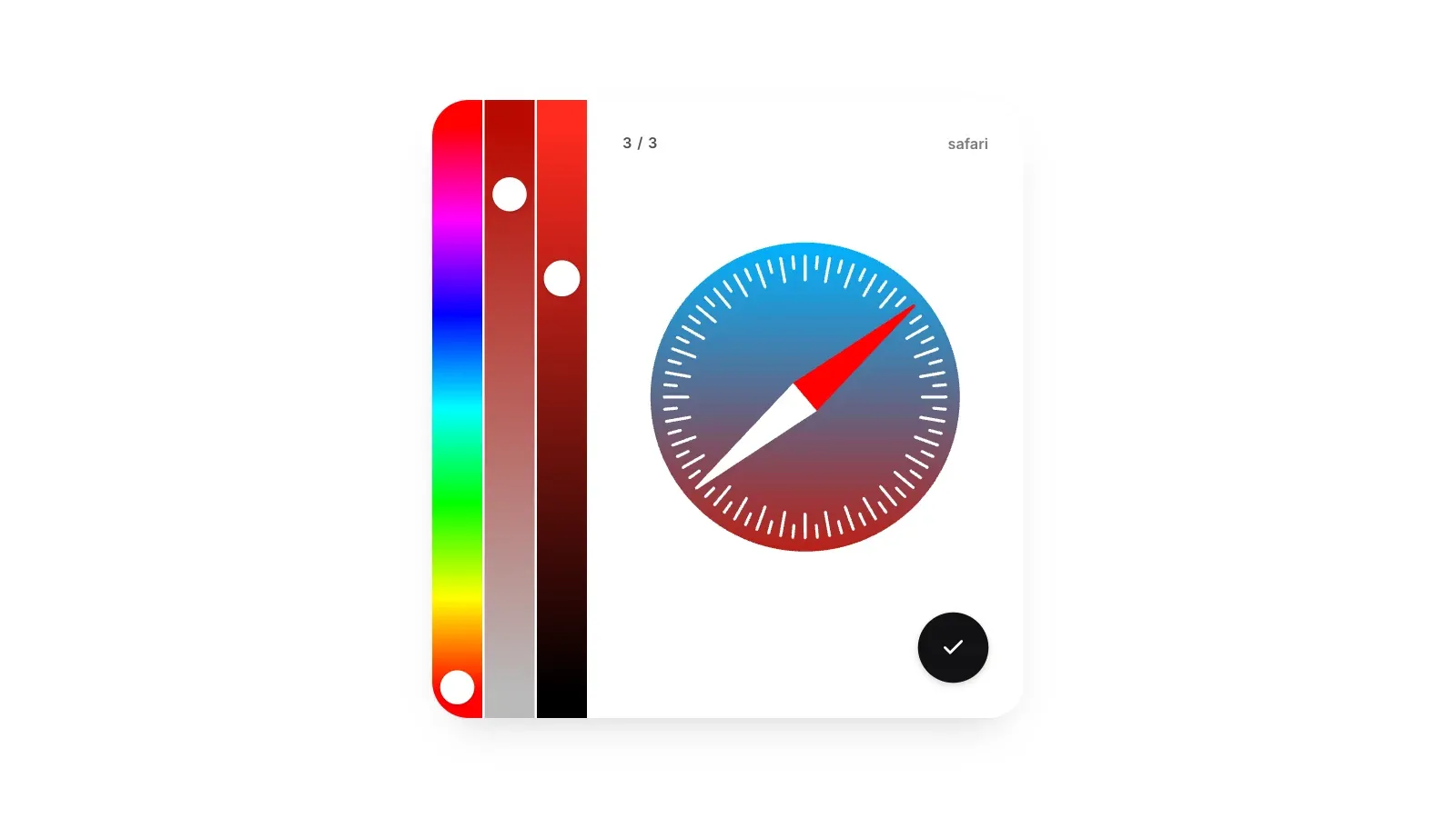
A few logos are gradients, like Safari's compass. Then the wrong part is one stop of the gradient, and the rest of the ramp keeps its true colors, so the color beside it is your best hint.
A Realistic Target
Eight points a color is a difference of about 10, which you would notice with the two side by side but would still call the same color. So 24 out of 30 is a good round in either game, 27 means every color was within a difference of about 6, and 28.5 takes three near copies, each within about 3.6. Expect your average to fall from Easy to Hard even though the scoring never changes: Hard's colors get less time and have fewer names to hold them.
Where to Play
Both games are free, with no account and no daily limit: a new round is ready as soon as you finish one. The Color Game has its three modes, Guess the Color of the Logo has its eight decks, and a switch above the card moves between the two. Best rounds and averages stay on your device, and Share copies your round as a row of colored squares with each score, plus each brand's name in the Logo Game, but never the colors themselves.
If you would rather train your eye for size than for color, we wrote up how to get better at Size It Up too.
About the author
Bernice is a marketing intern at Daily and an unapologetic puzzle nerd who never outgrew the games of her childhood. She writes about the platforms, trends, and small habits that keep puzzle fans coming back.